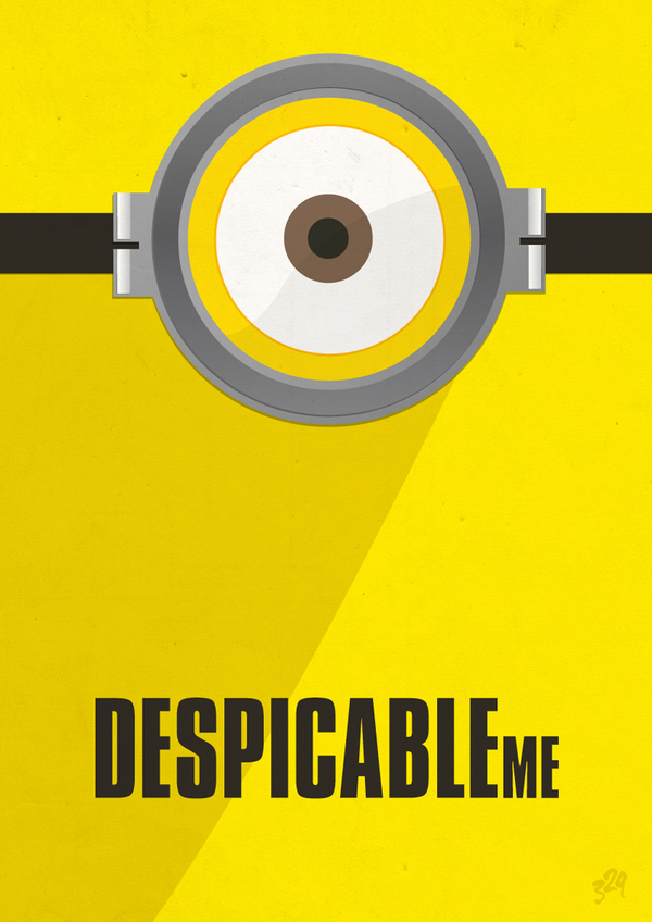
Minimalist poster - Basic Art Principles
When communicating you want to be as clear as possible, therefore good design is extremely important! So get to know the basics...
Design is creative but it does some follow some basic rules, follow these and your design may come out quite decent!
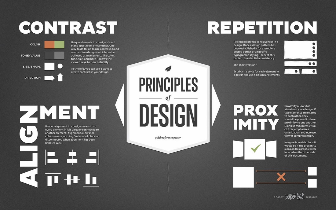
Contrast:
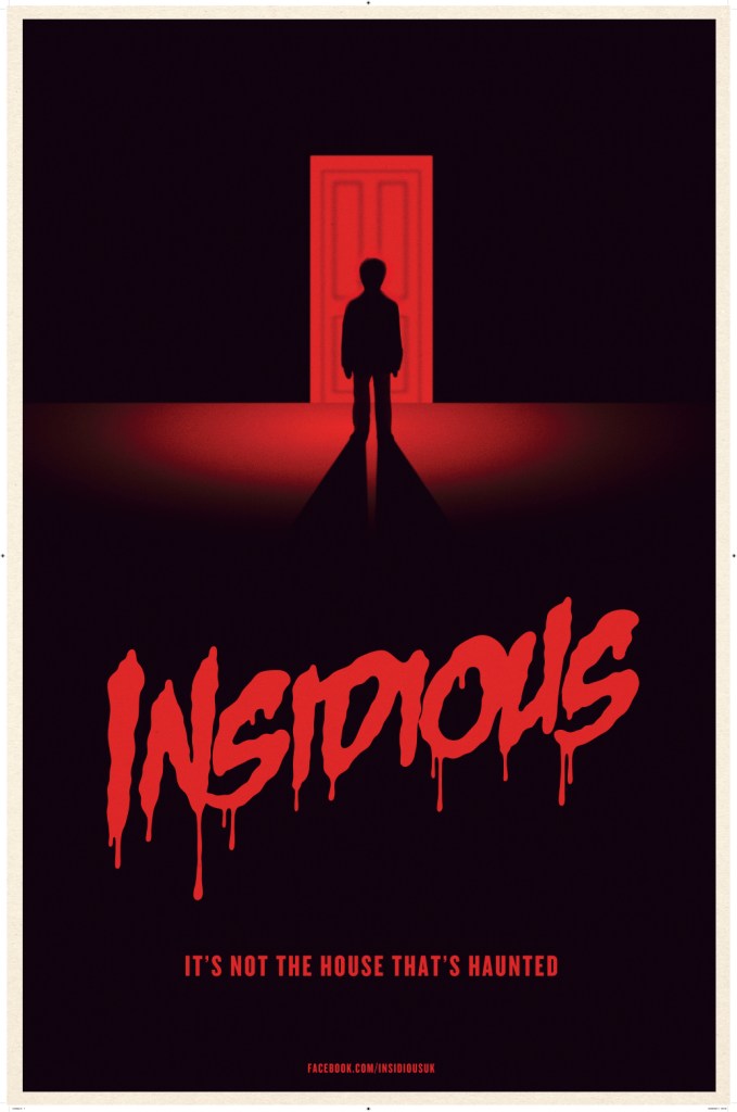
Contrast between design elements can make a presentation stand out and get noticed
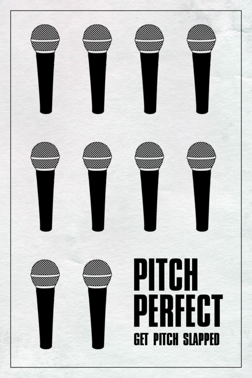
Repetition Repetition Repetition Repetition:
Like the use of repetitious hooks in a song, repeating elements in a graphic design can be visually appealing.
Alignment:
Aligning elements in a visual and readable arrangement
Proximity:
Grouping elements together so that you guide the viewer/reader to different parts of the message, adds unity to the message, instead a scattered mush of blah.
Space:
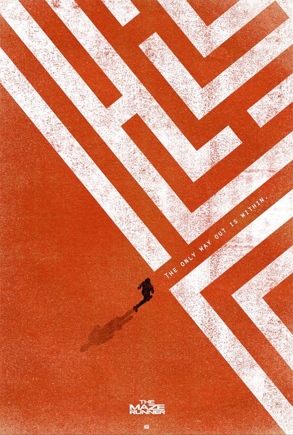
Using space wisely can allow ideas to be conveyed clearly with clarity
With good design you can convey stories that normally you would find boring!
Stuxnet is a computer virus that targeted Iranian nuclear reactors in the 2000's... (bored yet?)
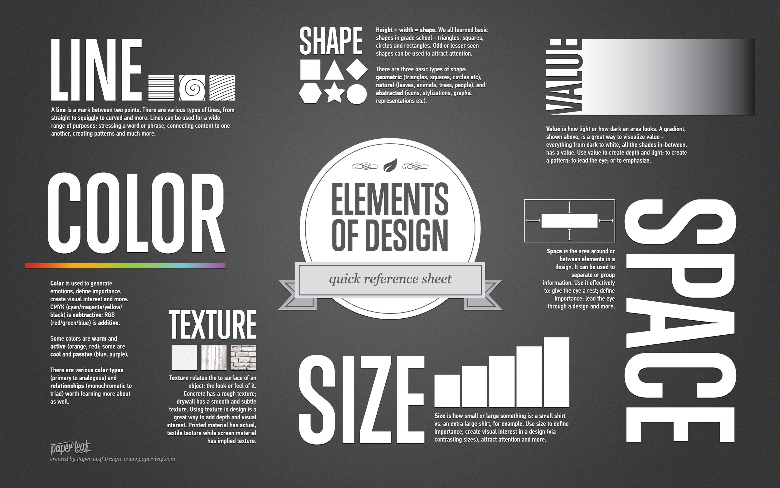
C.R.A.P.S is good but that's not all. Here's some info graphics that can help guide you to good design practice...
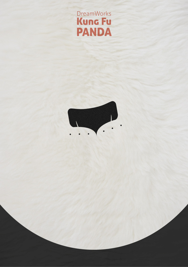
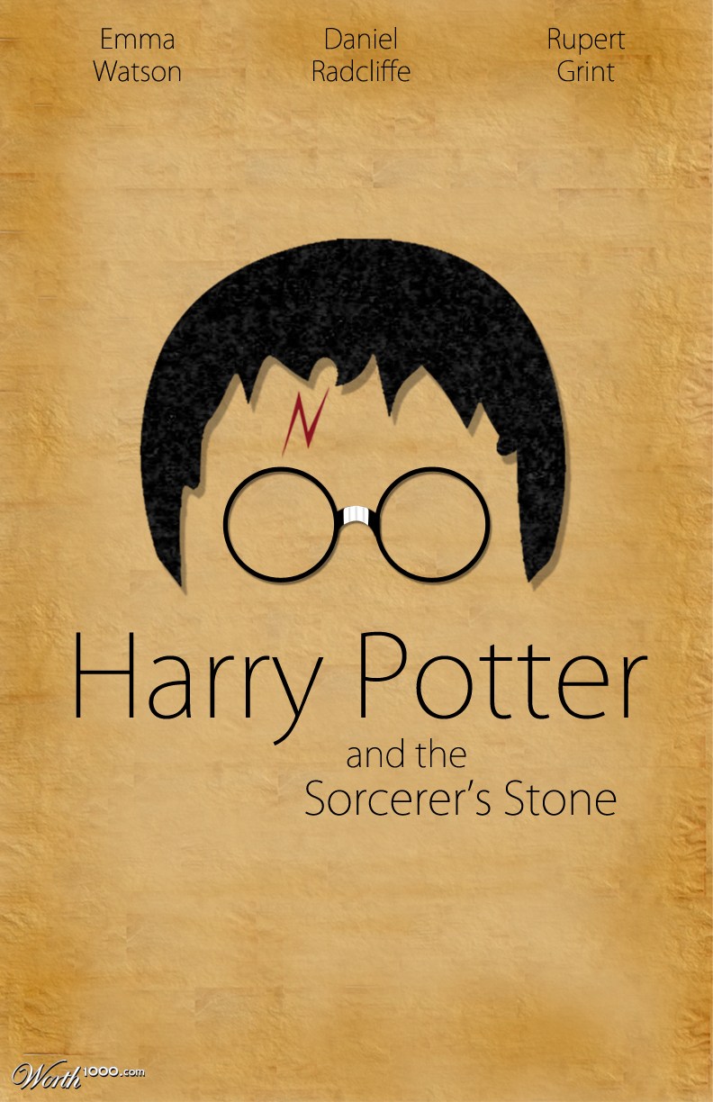
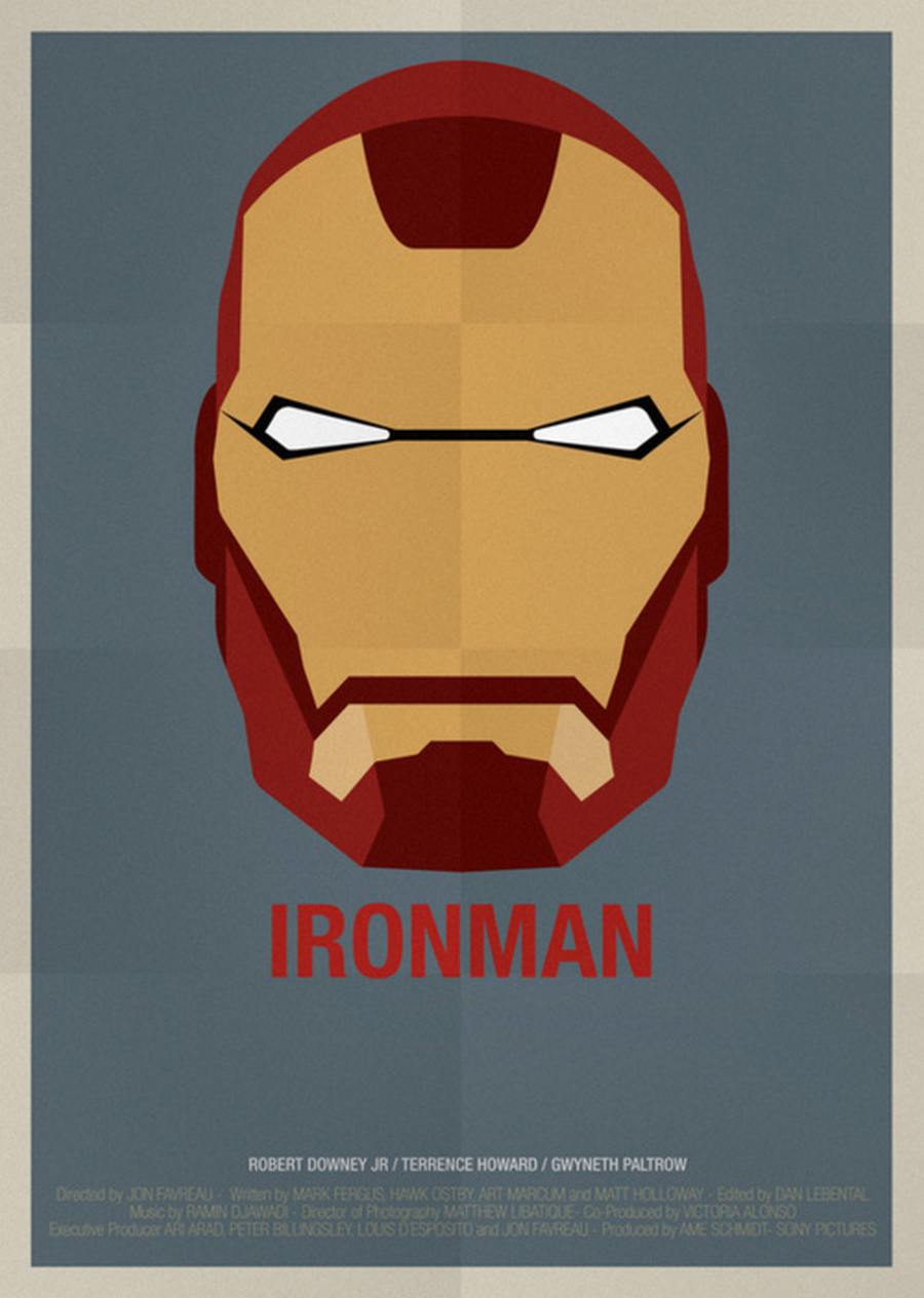
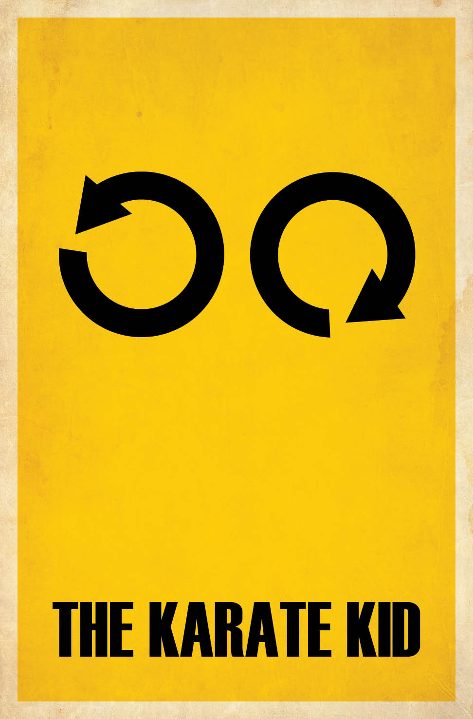
Assignment Minimalist Poster
Create your own minimalist poster!
Before you start can get frustrated with using Photoshop first remember this:
(command + alt + z) means undo, this will help when you screw up.
Before starting your own poster:
1. Choose a movie to make a movie poster for
Keep it decent (nothing inappropriate)
Popular movies other people can get references from
Movies that have memorable "artifacts" that are easily searchable online (ex. Dispicable me minions)
2. Choose an artifact from the movie
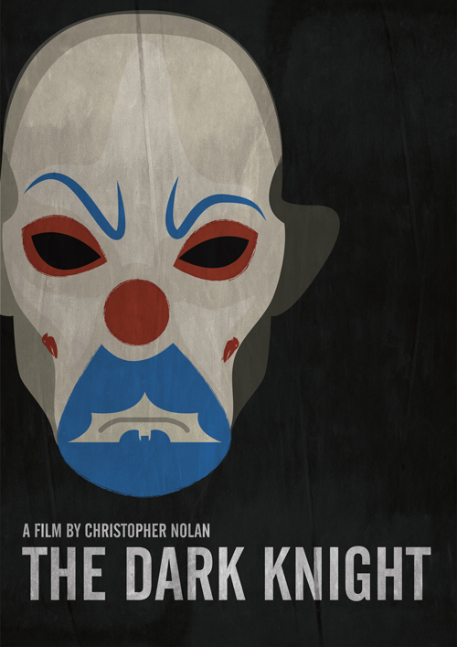
Choose something that can be simply conveyed with a silhouette
Make it easy to, don't overkill
Keep it simple, don't clutter your poster!
3. Draw out concept
I don't care how bad you are at drawing, you must sketch out a plan before hand
Fly it by me, I want to see your sketch, chances are I can help improve it
Again, keep it simple, but not too simple
Be clever, good design is "smart"
4. Design poster in photoshop
Use the skills learned in the first two tutorials to make a poster
Make sure you set your paper size to 11" by 17" and dpi to 300
Every time you create a new item/object create a new layer
Choose a nice font, comic sans GROSS, and unacceptable!!
